
The way my brain works, it helps to have what I’m working on sitting out where I can see it. Otherwise I get distracted and forget! I had the idea that I could have some kind of visual reminder of my composing project hanging on the wall, and I could stick post-it notes on it.
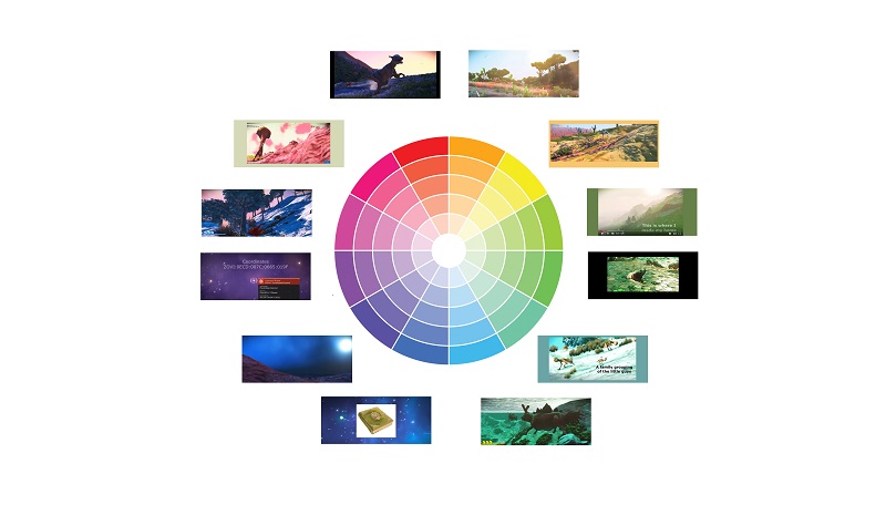
I arranged those 12 images (representing the 12 themes) around a color wheel. This made me realize that just as a color wheel has a range of color values (yellow is the “lightest” and blue violet is the “darkest”), a suite of compositions would have a lowest point and a highest point. I don’t think that the way I have the music themes arranged around the color wheel necessarily corresponds to the color values. In other words, I don’t think that the Empty Planet theme has to be the “darkest” and the Desert Planet theme has to be the “lightest”. But I should consider “how light does it get, how dark does it get” and arrange everything between those two extremes.
I have often thought about this while watching episodes of Doctor Who. The actor Peter Capaldi has such a range of emotions and I’m sure they sat down at the beginning of the season to sketch out “this scene is when you’re going to be in the most pain. This scene is when you experience the most joy. This is when you’re the most flat, bored, withdrawn, lethargic”.
One of my professors at HCC yesterday talked about “character development” in program music — does the music capture a character’s personality? Some composers do this especially well. She mentioned Ennio Morricone — a name I had not heard before. Though I did recognize this!
https://www.youtube.com/watch?v=h1PfrmCGFnk